Particulate Matter (PM) is a type of pollutant that is present in the air.
PM is a very small class of pollutants and includes pollen, dust, smoke, fog and even rain.
It is measured in μg/m3. According to this measurement, there are two types of PM values:
PM10: Matter that is 10 micrometers across. This is especially harmful for people suffering breathing problems, e.g. asthma.
PM10 since PM10 is formed primarily because of wear of road surfaces, for example due to studded tires during winter months [1].
PM2.5: Matter that is 2.5 micrometers across. Usually consists of gaseous matter, and can be harmful to people with cardiovascular diseases.
PM2.5 particles come mainly from various combustion and industrial processes [1].
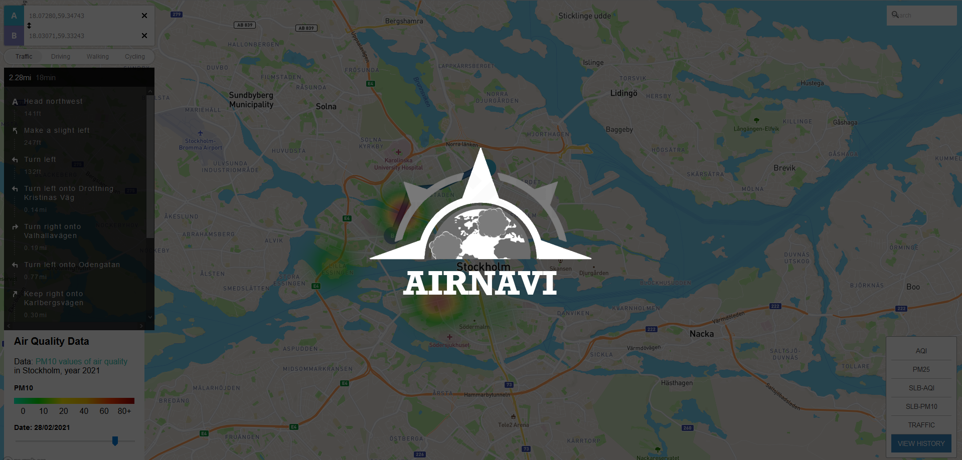
AirNavi visualizes up-to-date and historical pollution data to allow for safer travelling and route planning. AirNavi combines data from different sources to achieve the different interactable layers. The layers can be toggled on and off, and one at a time, without affecting the underlying map orientation. AirNavi uses the Translucent Overlay [3] technique to display each layer, in order to achieve clarity by making both the map and the pollution visible and manageable.
This data is visualized in the form of heatmaps, which provides a clear overview of where the concentration of pollutants is the most. The user can zoom to see the heatmaps in detail over the region of Stockholm, and compare it with the legend provided to decide if the air quality is healthy or not.
For the historical data, the user can filter on dates and select either PM10 or PM2.5 values. Details on the numeric value of these pollutants can be provided on demand if the user chooses to hover over the six data collection points, marked with the (i) icon. This follows the mantra “Overview first, zoom and filter, then details-on-demand” made famous by Shneiderman [2]
Realtime AQI heatmaps are provided through the Breezometer API [6].
Historical data is provided by AQICN which allows users to download recorded data of physical sensors in Stockholm, managed by SLB [5].
We are a team of Master's students from KTH Royal Institute of Technology. We have a combined history of front end and back end development, user testing and UI/UX design, both academically and professionally. Using our combined backgrounds we have created AirNavi as part of the course IVIS21.